
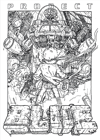
Episode 1: Project Blue

Entry posted by Scrobins in A Homebrew Draws Near!
2,855 views
A Homebrew Draws Near!
A blog series by @Scrobins
Episode 1: Project Blue

Introduction:
Promoting a new homebrew game must be exhausting, especially if you are maintaining hype and anticipation while continuing development of the game itself. Each tease must generate enough curiosity and excitement to stoke conversation while saving enough detail for the release, which has its own rules to communicate an engaging, persuasive pitch.
As a new game crosses the finish line, destined perhaps to become the next essential gem, here is an opportunity to learn the story of the heart behind the homebrew.
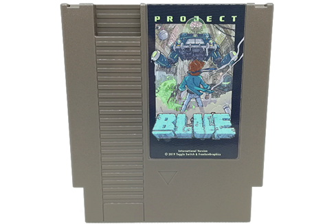
For this entry, I’m covering Project Blue, a new action platformer brought to you by the combined talents of toggle_switch, FrankenGraphics, and M-Tee. As of the time of this writing, the rom of Project Blue is available for purchase here, and the cartridge release is currently being assembled. If you missed out on the Kickstarter, you can e-mail pragmaticfanatic@gmail.com to get on the mailing list.
Development Team:
@toggle switch (Donny Phillips): programming, music, level editing, game & level design
@FrankenGraphics (Ellen Larsson): graphics, cutscene music, game & level design, campaign video
@M-Tee: cover art, illustrations, manual

Screenshot from Original Tech Demo
Game Evolution:
Though set in a dystopian future, Project Blue’s story can be traced as far back as 2017, when Donny and Ellen submitted a demo version of the game to the Annual NESDev Coding Competition, where Project Blue placed 2nd in its category.

Screenshot from Demo Submitted to NESDev Competition
Buoyed by effusive praise, Donny and Ellen brought M-Tee onto the development team and continued working on Project Blue, preparing all the materials necessary for an effective crowdfunding campaign. By late 2019 the team was ready, and Project Blue launched on Kickstarter on October 17, 2019 with an initial funding goal of $10,000. To help promote the game and show off the dev team’s sense of humor, the campaign’s trailer features a taste of gameplay in the guise of a VHS-quality “personnel training video” from OmniCorp’s Quality Control Dept., starring Ellen’s roommate.

OmniCorp takes quality control super seriously in its trailers, thank you for your service, Alonnika

The alt text suggested by Word for this picture was: a person wearing a hat and smiling at the camera
Before the campaign had been live for a full 24-hours, Project Blue exceeded its initial goal. Ready to ride that momentum, the dev team announced a slate of stretch goals such as demo releases of Project Blue (including the original tech demo Donny used to pitch the game to Ellen, as well as an updated demo), a retro desktop icon set, a graphics patch to gender swap the protagonist Blue, a game-themed winamp skin, enamel pins, a “heartless” mode difficulty setting, and a chiptune album by Ellen. Each of these stretch goals was quickly surpassed as the campaign ultimately received more than quadruple its initial goal.
UPDATE: On June 24, 2020, First Press Games launched a new Kickstarter aiming to bring Project Blue to the Famicom, potentially opening new avenues for expanding the reach of homebrew games.
ANOTHER UPDATE: On September 8, 2020 Broke Studio began taking orders for Project Blue, lowering shipping costs for gamers outside the U.S.
Gameplay Overview:
Project Blue describes itself as an action platformer, which is perhaps an understatement with an environment as dynamic as Project Blue’s. At first glance, you would be forgiven for noticing a lot of similarities to the Battle Kid games. However while fans of that infamously difficult homebrew series will find much to enjoy in Project Blue’s familiar gameplay, Project Blue offers a range of challenges all its own where you can fire projectiles, bounce on springboards, float on hover decks, glide with parachutes, fly with the aid of roto-caps, climb, swim, and more. In an early room of the game, a trampoline seems out of reach until you notice an enemy’s fire slowly breaking the block on which the trampoline rests; meaning a little patience will drop that trampoline right at your feet.
You play as Blue, a “volunteer” for OmniCorp’s experimentations capable of releasing bursts of bio energy from your forearms. Having escaped confinement, you trek across Neo Hong Kong to exact revenge against OmniCorp’s boardroom directorate. Don’t be misled, the board members and their interns are no armchair villains; their drive for power will give new meaning to the term “think tank”. Along the way, Blue will encounter an assortment of OmniCorp bots, security devices, and other hazards that will challenge players to consider how to pass between 256 different rooms across 4 levels. Don’t worry though, there are ample checkpoints as you progress, though you won’t know you reached one until you use it. Blue will also find heart containers to restore life, energy boosts to temporarily power up his bio energy bursts, 1-ups and credits (100 of which will buy you an extra life).
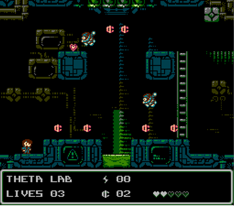
Gameplay screenshot
Writer’s Review:
Project Blue’s setting applies a thick layer of grit and grime to Neo Hong Kong’s concrete jungle, creating an engaging, lived-in cyberpunk world, reminiscent of Robocop, Blade Runner, and Dark City. Even the game manual stays in-character, playing the role of an OmniCorp investor portfolio while teaching you the game and building the sci-fi horror mythology that surrounds it.
Controls are tight and generally intuitive but contain subtle tricks that will benefit the player patient enough to learn them. For instance, jumping in place will allow you to jump fairly high but not as high as jumping while in motion. As stated earlier, the environment is incredibly dynamic, affording multiple avenues to passing from one room to the next, inviting creativity from practiced speedrunners as well as unskilled, but enthusiastic fans such as myself. The checkpoints are invaluable for a game as challenging as Project Blue, but I think the fact that the player doesn’t know where they are is a fun, if devious touch that raises the stakes for the player and adds a little anxiety to gameplay. A variety of enemies and hazards that would be cute if they weren’t so deadly offer more color and personality, further distinguishing Project Blue from its peers and forebears.
And of course, there’s the level editor. On the one hand I’m ecstatic that Project Blue follows in the footsteps of homebrews such as Spook-o’-tron and The Incident with the inclusion of a level editor so people can design their own levels and carry Project Blue toward infinite replayability. But on the other hand, if I’m already struggling with normal mode, what hope do I have with the inevitable Project Blue kaizo hacks? First Grand Poo World, next up Grand Blue World??? In all seriousness though, releasing the level editor is a clever way to excite players, expand the mythos of the game, and lower barriers to future homebrew development.
Project Blue is an excellent example of just how much the NES still has to offer gamers. And as one of the latest homebrew games, Project Blue raises the bar both in terms of style and substance. The physical cartridges have not even been released yet, and already Project Blue is taking its place among the pantheon of aftermarket gems. Bottom line: get this game. And if you are one of those people who plays a game like Project Blue then talks a big talk about making more challenging levels yourself, fire up the level editor and throw down.
Interviews:
For all we’ve seen thus far, there is more to Project Blue than the final product and the effective PR that keeps this game at the front of our minds. Behind Project Blue are 3 people whose skill and style give it life. To better appreciate the passion that went into its development, I spoke with Donny, Ellen, and M-Tee to learn more…

toggle_switch
-Before we get into Project Blue, I'd love to talk about you and your background. What was the catalyst that pulled you into coding, and what inspired you to develop a homebrew game? What is the origin story of Toggle Switch?
I used to 'design' video games as a little kid, circa 1987 or so. Mostly just coming up with enemy ideas or sketching levels on graph paper, stuff like that. So it's always been an interest of mine since a very young age.
I got into programming after watching Hackers a bit later in life (an extremely cheesy movie that I still have a soft spot for). I was probably 13 or so then, and even though it was obvious that programming computers wasn't nearly as fun as it looked in the movie, it hooked me anyhow. Demoscenes were big at the time, so I mainly learned by downloading snippets of code with our new 14.4K dial-up modem and dissecting them.
The first time I tried to make an NES game, was probably 2001 or 2002. I was able to find one tutorial by a kid that taught how to set the color of the screen. The only other stuff I could find was just lists of technical data, so I gave up. I tried again around 2006-2007 and again wasn't able to find the resources that I needed - I'm not sure if I just didn't find them or if they still didn't exist at that time.
As soon as I became aware that making NES games was a possibility, I started trying to learn the necessary skills to do so. I think that would have been around the time that Lizard, an NES homebrew by Brad Smith, was on Kickstarter - that was the first game that I found out about.
After reading the forums and wiki at NESDev for a few years, I started working on Project Blue in 2017. It's my first NES project of any real size.
-Who are your influences? And whose work are you watching closely now?
In the homebrew scene, I've been inspired by the success of several projects, I think the reception that Twin Dragons and Nebs 'n Debs got really made me want to put out a game that could be mentioned in the same sentence as those two. And of course I mentioned Lizard above, that was the game that got me interested in making my own game.
I try to keep a close watch on the whole scene, but it's getting so big now that projects seem to come out of nowhere! Watching the homebrew scene really coalesce into what feels like a new golden age in the last few years has been amazing. I feel really lucky that it happens to coincide with our game coming out.
In the broader world of video games, I found that Edmund McMillen, developer of Super Meat Boy, has some really good advice on level design that I did my best to follow while making Project Blue.
This discussion with the legendary Shigeru Miyamoto on how they made World 1-1 in Super Mario Bros also shaped the way that I approach level design.
-Your work on Project Blue spans the game's coding, music, and level design. In developing it would you say it has any qualities that seem so quintessentially you? How would you describe your aesthetic? What was the evolution of your signature style?
For my part, the aesthetic of Project Blue is strongly influenced by cyberpunk and post apocalyptic media - including things like Fallout, Johnny Mnemonic, Blade Runner, Elephantmen, etc.
Honestly the game world was pretty thin before Ellen started making art. Once I saw the art she had made for Level 1, the game evolved from more of a plastic-y, sci-fi future, to a dark, grim, corporate nightmare.
-What tools do you use to code and compose?
For coding, I swear by NESICIDE. And for composing, just regular old Famitracker.
-Tell me about the evolution of Project Blue, what was your process for taking an idea and manifesting it? How did Blue himself evolve from your initial tech demo to the final game?
Project Blue is my first attempt at doing anything on the NES, really. So it began with me seeing if I could put graphics on the screen, then adding sprites, then adding code for the controller, and so on and so forth. So I was really just learning as much as I needed to complete the next step at any point in time. In the end, this meant a lot of decisions that I made were locked in before I had fully understood their ramifications, which was pretty frustrating on occasion. But overall it was a great learning experience and the engine I'm designing for my next game is going to fix a lot of those errors.
As for Blue, he started out as an avatar of myself as a young child. As the world around him formed, he went from being a Platonic ideal of a heroic figure to having more of a tragic backstory. On the gameplay side of things, he's modeled after both Mario and Mega Man - he moves like Mario, but shoots and has a health system like Mega Man. And he's smaller than both of them, which makes him harder to hit!

Portrait of the artist as a young 8-bit man
-I think it's fair to say that the protagonist represents the player's point of immersion in the game, and how we perceive and understand the protagonist contextualizes how we perceive the game's world. You said that the design for Blue's character began as an avatar of your younger self, what qualities were at the front of your mind when designing with that intention? Was the evolution of Blue's sprite from your tech demo through the NESdev compo entry and ultimately to the finished game, cover, and manual a rapid or gradual process? How did that conversation with Ellen and M-Tee unfold?
When I was a kid I used to dream about making Nintendo games so it just felt natural to have a little version of me in the game. The graphical restrictions on the NES make it hard to include much detail, so my original mockup was just of me with brown hair wearing jeans and a denim jacket, which was a fairly common outfit for me in the 80's.
Initially Blue was a hero breaking into Omnicorp's facilities to stop some evil plot, eventually we changed him into a victim of Omnicorp, escaping from a testing lab. This changed pretty much everything and provided the character with some actual adversity to overcome. And really the rest of the world began to take shape around that.
The rest of the character was fleshed out when Ellen and I asked M-Tee to do some illustration for us. He began asking questions about the game world to inform his art, which in turn meant that we needed to invent answers and create a more cohesive game world.

Gender-swapped protagonists demonstrate OmniCorp does not discriminate in its experimentations
-What was it like working with Ellen and M-Tee? How did you connect with them for this project? Is there Rolodex for finding game development talent?
Honestly it was a great experience. Not having any skills when it comes to pixel art or illustration made it very hard to start on a project.
The first thing I did was just start the game by myself using some free pixel art I found online. That allowed me to start working without a partner. I had been eyeing Ellen's work from a distance on NESDev, and it just so happened that she posted a thread looking for collaborators at the same time that I was finishing up a demo I'd made specifically for her.
We brought on M-Tee later in the process to do the illustrations for the box art and manual, and I've been very pleased with the results. I've honestly been very hands off and allowed them both to have a lot of freedom in developing the world as they see fit, only stepping in if something strongly contradicts my own ideas.
So it's been a very collaborative process between the three of us.
-Project Blue has a fun setting and premise to immerse the player: battling an evil corporation in the midst of a post-apocalyptic hellscape (do I detect an homage to Snatcher?)? How did this engaging universe coming into being? Was this a story that always fascinated you, or did the gameplay come first and you then built a world around it?
Never played Snatcher... the main inspiration for OmniCorp and the general world (or at least, the parts that I have a hand in) is an indie comic called Elephantmen, wherein the MAPPO corporation designs armies of genetically modified animal/human hybrids in effort for global domination. But instead of being about all that, it takes place decades later as the hybrids are attempting to integrate into a normal society. Another large inspiration is Fallout, and the corporate antagonists Vault-Tec.
The first iteration of Project Blue took place in an obviously fictional city named Pixel City and involved the player breaking into an OmniCorp facility to stop some sort of vague plot that was never really fleshed out in any way. So while there was an evil corporation and the same protagonist, the world itself was much more childish and whimsical.
At some point we didn't have enough art for a scene of Blue breaking into the facility so we just decided to have him breaking out instead. To accommodate this, the world slowly became darker and grittier, which ultimately I think was a change for the better. The original 'plot' was very boilerplate - it didn't have a lot of character or originality, because it wasn't something I put a lot of thought into. Through our collaborative process I think we developed something that feels a lot more fleshed out and compelling.
As for the last question, gameplay absolutely came first. One thing that I really wanted to nail was strong controls. As I mentioned above, the controls are loosely based on Super Mario physics, which ultimately ends up affecting how you design the rest of the game, because you have a player character that is immensely agile and fast. And for me, I would think of what game mechanics I wanted first, and then how we could accommodate those mechanics within our world. I think Ellen might do it the other way around though, so it might be a bit of both as she had a hand in developing the mechanics for levels 2 and 3 in particular.

Breakout!
-What new challenges or surprises surfaced in developing Project Blue? What lessons did you learn that you would like to share with the people who follow in your footsteps?
The biggest problems I had all stemmed from designing engines that weren't flexible. Like, for some unknown reason I hardcoded in that sprites could a maximum of 4 tiles - which repeatedly came back to be extremely annoying. So always design flexible systems that can be used for as many things as possible.
Second, I made a lot of mistakes at first in trying not to waste ROM space. But then we ended up switching to a mapper that had way more memory than we needed anyway. So my second piece of advice is that ROM is the easiest limitation of the NES to "cheat" on, and you should take advantage of that as necessary.
-Social media is aflame right now with praise for Project Blue! How does it feel to bask in such support?
Honestly it's such a relief to have it out there and for people not to be disappointed! So far I've actually only received positive feedback, which has been incredible.
-Is there another project after Project Blue on the horizon? Another dream project that you hope to bring into existence?
Right now I'm working on a new engine for the next few games I want to make. It has a ton of substantial improvements over the Project Blue engine - 4 way scrolling, DCM support, more flexible sprites, more space for graphics, cutscenes, and so on and so forth. I'm really excited to be working on a new engine after being sick of the old one for well over a year!
Ellen is onboard to make our next game, Project Violet. Violet is Blue's older sister - she's bigger, faster, stronger, and she does wall jumps and other neat tricks. So right now I'm building a level editor and the engine for the game side-by-side.
-I really appreciate you taking the time to talk with me and share your experiences. Is there anything else you would like to tell readers and fans?
Thank you all for your support!

FrankenGraphics
-Before we get into Project Blue, I'd love to talk about you and your background. What was the catalyst that pulled you into coding and pixel art, and what drew you to the NES in particular? What is the origin story of FrankenGraphics?
It started early. Me and some other kids used to draw our own level designs on paper back then. For me it was bubble bobble, Castlevania and blaster master. It was all a creative fantasy. But one summer day, my grandma pulled out all her old cobol and fortran programming sheets and showed me. I didn't understand any of it but was immediately retro bitten; back when retro would have been something wholly different, because kids still played the NES and SNES at home like it was something current. This was sometime in the early 90s. From there I took every chance I got. Sometimes I’d wait at dad's workplace, I’d find myself pixling patterns all zoomed in on paint for windows 3.11. Eventually, I got a decommissioned 286 laptop from my moms' job. it only had what amounted to 16 ega colours through a monochrome display, but I started using qBasic for manually putting in bitmaps and drawing simple things. My older brother got a mac, and with it came resedit, which is a hex editor with some graphics editing capabilities. that meant I started doing 16 by 16 pixel objects in 256 colours. I hacked some of my own graphics into a shareware game called Realmz. At this time though, I mostly played the NES because that's what we had. The SNES was already out and then came PlayStation but I mostly played NES games throughout my upbringing. We never got any other console and I wasn't particularly interested in upgrading either. I remember trying out Nintendo 64 at the toy store and deciding then and there that this wasn't my cup of tea. It was either the NES or PC gaming for me.
At some point in 2008 I was looking for a way to tap into my nostalgia; primarily qBasic for DOS. I was looking for equivalents on modern platforms but nothing suited me. Then I started googling for NES development instead and found the NESDev boards. I didn't put any commitment into it then, only went there for reading some threads occasionally without ever registering. That happened in 2016, I think, when I saw the works of a few other pixel artists and decided I wanted in on it. I was serious this time.
-It sounds like computing and programming skills run deep in your family, and they were a great influence on you, can you talk a little bit about their line of work?
It's sort of the opposite... grandma used to program in her day, back when administrative work meant programming. But I’m definitely the technical support for my parents. they didn't show any interest in us picking it up as a hobby so I once again have my grandma to thank for sending me a yearly subscription of a computer magazine when I was growing up, haha. Mom used to be a city planner and dad used to be a school teacher, mom doing a lot of technical drawing for traffic, parking lots, parks and rec probably had a big influence on me being more interested in the where the artistic and technical side of computing meets. I never pursued learning programming in any professional capacity, but I’ve mostly been in tangential fields of work, like interface design and such.
-Who are your influences? And whose work fascinates you today?
I grew up particularly liking the style of games like Castlevania III, Batman, Metal Gear to name a few. I think you can see that most of my pixel art for the NES uses the same "fade to black" technique. Black has this fantastic property that it leaves it to the perception of the viewer to fill in the blanks, which is very useful when you've only got so many tiles to work with. It doesn't need to be black really, you'll find this in a lot of art. Shades and shadows are often a lot less detailed, which both gives the eye some rest, orientation, and at the same time leaves things to the viewers' subconscious imagination.
I decided to join NESDev after seeing works such as the pixel art of thaddeus, who'd made new fan graphics for Simon's Quest that looked lovely. At the same time I was exposed to "Super Bat Puncher" by Morphcat and thought that just maybe, there was a possibility to make something for this old console, even for me. So that's the turning point for me, I think. I decided I wanted to do original works only. No fan games or hacks. I had done a little bit of that before; changing the roster and looks of Volleyball for example. But I wanted to do something to call my own.
For influences, I look a lot outside pixel art, to be honest. I particularly like other forms of forced formats, such as pointillist and impressionist paintings, stained glass, what tends to be called "the golden age of illustration" (think novel illustrations for Arabian Nights, King Arthur, folktale stories), woodcuts, and east bloc mosaics.
Within pixel art, I particularly like the palette animated 256 indexed colour works of Mark J. Ferrari.

Jungle Waterfall – Morning, by Mark J. Ferrari
-I remember back in the NintendoAge days you sold a few copies of your concept cart, which you also give to young girls at workshops to pique their interest in computing and game design. Tell me more about these workshops. What are your observations on diversity in the game design community?
I used to hold a few workshops a few years back. It wasn't expressed as exclusively for girls, but I particularly addressed them because I’d like to see the game industry more diverse than it is now. They'd spend half a day making graphics for the NES and then actually put it on cartridge. One of the workshops was held at a museum, so their works would be displayed on an NES and tv screen over that summer. If they liked it, they could burn a cartridge and take it home. Maybe, some day, some of them might continue that journey, is my hopes. I haven't had much time to put together new workshops lately.
My thoughts on diversity? Too little of it, still today.

Box art for FrankenGraphics Concept Cart
-Your work on Project Blue covers pixel art, level design, and putting meat on the bones of Donny’s initial idea. In the words of your Kickstarter page, how did a vague idea transform into a fully fleshed out world?
When Donny contacted me, he simply wanted me to replace the placeholder art for his tech demo; especially redraw his sprites. The game then already felt about the same in terms of player physics, but the story was something like "pixel guy in video land shoots pellets". Not an exact phrase from anywhere, but that was the kind of feel. I felt it could use a setting. At the time, I had just read Cixin Liu's The Three Body Problem which is about a lot of things, but one particular passage was about an experimental computer lab deep in the woodlands of china in the 70s. The first level set was clearly inspired by that and the rest kind of just evolved. For the second zone, I did a lot of research on illegal housing in big cities around the world and eventually decided to go for a dystopian, future version of the Hong Kong peninsula. The "dezone" as we call it in game was made to imply some history without telling exactly how and when. But you can note details such as some places looking like squats in deteriorating high rise buildings, and the squats themselves are also mysteriously abandoned.
Eventually when M-Tee came on board for the box and manual illustrations, we fleshed out the finer details together in a group chat; most of which doesn't directly show in the game. But M-Tee came to author the text of the manual, so a lot of the information about the world of Project Blue comes directly from his pen.
-Given your work on the pixel art, how would you say Project Blue reflects your particular style? And to take a step back, how would you describe your aesthetic generally?
There's hardware limitations and there is software limitations. I think I managed to get a lot of my style into Project Blue; especially the backgrounds, but it is in many ways a very constrained game making some strict assumptions about game objects and level layout. Although I tried my best to hide it, you can often tell signs of the metatile compression which has a very special "look" many associate as the "NES" style, although it's not necessarily a mandatory trait of the system. (I try to remove that trait altogether in my gothic romance project, tentatively called "Borscht" for the lack of a good name, to show what the NES can really do, given enough storage spent on levels). The bonus of this is that we managed to fit three completely separate versions of the 256 screens into ROM memory of the game, which ultimately means there's 768 level screens in total in that game. I can't safely say every one of them is unique, and some changes are very subtle, like nudging enemy positions a few pixels to make them shoot oftener and such, but that has got to be some kind record on the platform. One thing I’m proud of is that the art helped make Project Blue a platformer game with an 8x8 granularity, which especially shows in the more organic environments of "the dezone" and "underground". Most NES games stick with a 16x16 collision grid because that is a convenient coincidence with the coarse palette grid. But 8x8 collision gives you a lot of finesse in terms of platforming and challenge design. The height axis is especially important.
I think I’d describe my style as dirty, fuzzy, maybe organic. I'm not great at sharp lines, bold strokes, simple design or cartoony clarity, and I’m not too good at character concept art either - but I’m pretty good at hiding patterns, attention to details above all, and also colour management and figuring out ways to get the most out of the technical limitations. For the end screen, we're using a very rare trick that sets the Red and Green emphasis bits together, which shifts the whole palette towards tan and yellow or otherwise warm colours, while blue colours tend to lose saturation. This was never done before in an actual game, to my knowledge, so emulators vary wildly from each other and an actual original NES. My hope is that emulator and clone developers will pick up the challenge to get the hues, saturations and slightly dimmed brightness correct.
For my own sake, I don't like when things are too clean, but can sometimes appreciate it in the works of others.

Project Borscht teaser shared on VGS
-What tools do you use to code and create?
Not that I did any coding for Blue other than making some data tables - that's all on Donny's side of the table. But for my own projects I use sublime (text editor) and ca65 (a 6502 assembler; part of the cc65 suite). For graphics, I almost exclusively use shiru's NESST (NES screen tool). Occasionally I use other tools such as aseprite and photoshop but they're not as platform specific, and generally too slow to work with.
On one hand, I think we're in a golden age, at least for the NES, because we've got a lot better documentation, tools, and community support than the devs of the historical NES library had at their disposal. On the other hand, pixel art in general is in a bit of a dark age because the old tools that professionals used to use don't work anymore. New tools are often either very specific, or have clunky interfaces. Indexed colour animation is not a feature in any of them. There's no concept of position animating an object separately from the pixel animation cels, unless you take the detour and montage still frames in AfterEffects. At least, if you batch export your frames from your pixel editor, AE would update its assets automatically.
Many seem to recommend pro motion, but you have to accept a very particular workflow that is definitely geared towards modern bitmap works, and while others seem to have success with it, I can't seem to gel with it.
What's really great about NESST, if you're only making NES graphics, is how direct the interface is. Everything you do a lot is one click away; sometimes with a modifier key. That's twice as fast as toggling tools with a hotkey (the photoshop/aseprite way) and then clicking, and you never have the headache of mistakenly using the wrong tool when you click. The caveat is that you absolutely need to read the readme, experiment some, and then read it again to get the most out of it, but that's the price of an efficient interface. I think the NESST way of doing things is commendable. If you're going to spend a lot of time with a tool, efficiency is more important than beginner friendliness.
Most of my work on Project Blue was carried out inside Donny's custom Level Editor. I think I spent something like 10% on the graphics themselves, 10% campaigning and keeping in touch with people, and 80% on the never ending process of making the levels fun and robust.
-What was it like working with Donny and M-Tee?
It's been great! They're great guys. We've always an understanding that we'd be in it long term. It's kind of funny how we live in totally different time zones, though. We've never had the benefit of working together on it in the same room. You can't have creative sprints the same way like this, but on the other hand you get to sleep on things a lot. So it probably takes more time with all the extra communication in letter form, but it's worth it.
During the most critical period of laying things down for the game, we used the productivity tool Asana, but we've mostly restored to mail and chat across several platforms. I still use Asana sometimes for organizing myself though.
-Project Blue’s level designs thread the needle of easy to learn, but difficult to master. How do you strike that balance? How do you please both casual gamers and gluttons for punishment?
I think the short answer is, you don't, as in there's no single action that suddenly makes it balanced. It's a lot more like wood carving, I think. At first, you get the coarse shapes out, then you spend a lot of time on the small details.
But I think what helps Project Blue have something for different play styles and skill levels is that it offers different promises for different people. If you're more of a casual platformer player, the reward is to survive and get to the next room. If you're doing it for sport, there's a lot of headroom for improving your finesse - making elegant jumps and shots. Then, you might want to try to see if you can make it on time. Then you've suddenly raised the difficulty bar for yourself because Project Blue is a whole different game when you play it calculated and safe, and when you're trying to run through it. I'm hoping we're satisfying skilled speedrunners too, because there's a lot of both tactical decisions and finesse to improve, and secret shortcut tricks to discover. Beyond that, I think we were just really lucky when combining the SMB-like acceleration and jumping scheme with tricky level layouts like this turned out to be a fun recipe.
-What new challenges or surprises did Project Blue present to you? What lessons did you learn that you will carry forward to future projects?
For me personally, Project Blue is my first big NES game. I've collaborated before on competition entries, and they were all small. I think I’ve learned a lot about the general workflow and how to not waste too much time.. it's been a trailblazer for me. If I have one design regret, it was that we used one (quite big) metatile dictionary* per as many as 64 screens. That took forever to optimize, and it was also too easy to break it since a change on one screen could have destructive implications on other screens using the same set. Had we redone it today, I’d say one definition per 16 screens or something.
I'd probably also take the investment and make the twice amount of tilesets for that many screens - I think it'd pay off both in looks and in saved time, ironically.
*A metatile is a defined instruction for the placement of one or usually several tiles. Often in a group of 2x2. Each zone in Project blue has a metatile dictionary of 256 metatiles, and then another dictionary of 1024 meta-metatiles. I don't think most players will notice, considering Project Blue has a more detailed levels than most NES games, but that was spread dangerously thin across the 64 screens sharing them, making level design a resource distribution puzzle.
-Social media is buzzing with praise for Project Blue, calling it one of the best homebrews ever! How does it feel to bask in such support?
Haha do they? I've mostly paid attention to the reviews we've been getting on itch, and it has been heart warming. Like, it was all worth it. People seem to be enjoying the game and that's all I could ask for.  It's a shame itch reviews aren't automatically public, because that could probably help casual itch browsers passing by trusting us as game creators.
-Is there another project after Project Blue on the horizon? Another dream project that you hope to bring into existence? I’ve been enjoying your teases for Project Borscht on VGS and I’ve seen the page on your website about an idea for a roller derby game.
I'm working on Halcyon with Nathan Tolbert (although, it has been a very improductive year for me on that end, I’m just picking up the pace again). It's a planetary exploration and action game in and out of a vehicle. People will no doubt compare it to both blaster master and Metroid.
"Project Borsht" is definitely my passion project. I've written most of the music for it, and now I’m making scenes based on the impressions the music gives me. It's going to be a gothic romance platformer with a splash of Slavic folk tales, superstition, and history, but set in an alternate fairytale version of medieval Europe. I also hope to bring a bit of inspiration from Poe's "the masque of the red death" into it, but most people will probably recognize it for being inspired from the platforming action from Castlevania and atmosphere from Simon's Quest.
We (mostly Donny) is already working on the foundation of another game set in the same universe as Project Blue. All I can say for now is that it will probably have a different feel to it, gameplay wise, like all proper NES sequels seem to have. It does scrolling, has a bit coarser level structure, and the character is going to be a bit more agile in some ways than blue was.

Teaser image of Halcyon from Frankengraphics.com
-Also I have to ask since you mention on your site that you train with Gothenburg Roller Derby, what position do you play and what is your derby name?
Haha oh my, does my blog still state that somewhere? I was just a rookie for a few seasons before work got in the way. My derby name was "hen hysén" which was a bad pun on replacing a locally well-known soccer veterans' forename with the Swedish gender-neutral pronoun. the word "hen" (singular they) caused lots of debate when conservatives reacted to when the author of a children’s story used it to describe its protagonist back in 2012.
-I really appreciate you taking the time to talk with me and share your experiences. Is there anything else you would like to tell readers and fans?
Thank you! Maybe.. Tell your friends about Project Blue... or rather NES homebrew in general! Invite them over. I think lots of people who'd love to play new NES games coming out simply don't know that it's a thing.

M-Tee
-Before we dive into your work on Project Blue, I'd love to talk about your work generally. What inspired you to be an artist generally, as well as a graphical artist for homebrew design specifically? What are the origins of M-Tee?
An amazing high school art teacher put me on the path to becoming one myself, although I worked a lot of jobs along the way, ranging from day laborer to graphic designer. The first few years I was finally teaching, I was building a portfolio of short stories and comics for children's illustration. I also got involved with a local arts group, exhibiting work a couple of times a year. Neither fully satisfied my creative itch, and despite the fact that I was making all-ages art anyway, the pressure of creating artwork as a teacher—where everything I was sharing would be google-able by current and future students and parents—was becoming overwhelming.

A Montage of Pre-M-Tee Artwork, 2010—2013
Looking for a lower stakes creative outlet, I penned the M-Tee moniker to dip my toes back into my old teenage hobby of ROM hacking. But so few people were actually creating new content in that scene. Optomon and his project, Pyron (which we’d later retitle Pyronaut), were a notable exception. I joined him and we worked on that for a while before putting it on hiatus for each of us to do other things. Most recently, he released Rollie, which I'm super stoked to play.

Learning NES Graphics Restrictions through ROM Hacking
(Unfinished / Unreleased Works from 2012—2014)
Meanwhile, I'd come across the homebrew scene on Nintendo Age, and it was full of people doing exactly what I wanted to support: the creation of totally new content—IPs and all. In time, I'd end up contributing not only graphics, but illustration, packaging design, game design, and writing for NES homebrew. It has been a fruitful outlet for nearly any creative desire I've had, and the community as a whole—both developers and fans—have been more of a supportive audience than I could ever ask for.
I had originally thought I'd be working as M-Tee for just a few months to scratch a particular itch, but I found it far more rewarding than the other work I had been doing, and now my M-Tee accomplishments are proudly on my résumé. If I'd known that going in, I'd have put more than 30 seconds' thought into choosing the name. (Long story short, M-Tee is essentially short for manatee.)

M-Tee Cover Art to Date
-Which artists initially inspired you?
As a student, I found Western art history intensely boring, but I would occasionally latch onto the more visually interesting stuff like the densely detailed and humorously bizarre work of Hieronymus Bosch. Outside of class, I’d seek out other artists who appealed to me. One of these artists was Jesús Helguera, whose bold figural compositions have definitely influenced my body of work. I also got into Japanese woodblock prints at this time (and would later spend time as a pretty active printmaker myself, a likely contributor to my comfort with limited, flat colors).

Details from Artwork by Hieronymus Bosch, Jesús Helguera, Kobayashi Kiyochika, and Giorgio Morandi
As my interest in color theory grew, I started getting into painters like Giorgio Morandi who worked within a very specific, tightly keyed, palette: high in value, low in saturation. I’d soon find similar palettes being used in French sci-fi, masterfully complimenting the work of animation director René Laloux and the ligne claire drawing style of Moebius.
But more modern artists, including Ulises Farinas and the late Seth Fisher, had been combining the same clarity of line with dense, Bosch-like detail and humor. This type of art, and the way it rewards viewers for studying it in detail, is very much what I’ve been wanting to explore for the last few years. (In fact, there are a few Easter eggs hidden away in the Project Blue cover art.)

Details from Artwork by René Laloux, Jean Giraud (Moebius), Ulises Farinas, and Seth Fisher
-Whose work do you enjoy viewing now?
These days, there are so many talented artists putting out amazing work: the way Ramon Villalobos communicates the mass and power of the human body, the ridiculous amount of personality Sara Alfageeh conveys in her figures, Erica Henderson's bold character designs, and Jey Odin's intense visual energy are all traits I enviously admire.
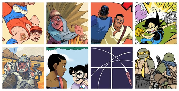
Details from Artwork by Ramon Villalobos, Sara Alfageeh, Erica Henderson, Jey Odin,
Conner Fawcett, Brittney Williams, Jesse Lonergan, and Sophie Campbell
Aw, geez. Who else? Conner Fawcett’s lineart and colors are amazing. I’ve long been a fan of Brittney Williams, so I'm stoked to see her getting higher profile work. The silent geometry in Jesse Lonergan's Hedra is astonishing, and Sophie Campbell’s got me re-interested in the Ninja Turtles for the first time in a very long time.
-You've done work on The Cowlitz Gamers’ 2nd Adventure, Gruniożerca 2 & 3, Pyronaut, and are an integral part of the Action 53 series, among other projects. Each looks stunning, and has certain qualities that seem so quintessentially you. How would you describe your aesthetic?
That’s very generous, but any style I have is likely just the result of me trying to compensate for my own weaknesses. The program I studied under put a heavy emphasis on formal composition and not much on developing representational skill—which it treated as a lower form of art, a trade craft for commercial purposes. I was repulsed by that type of high horse gatekeeping then and still disdain it today. Regardless, I came out fairly confident in my use of color and space, but I didn't (and still don't) have the muscle memory or fine control needed for technical drawing. Instead of trying to hide that fact, I revel in it with hand-drawn logos, beat-up machinery, and creepy creatures. Hopefully my use of color and composition hold them together well enough to make up for my wavering hand.
That said, there are a few elements in my visual vocabulary that I do tend to fall back on, for better or for worse:
- I like to work within a tight value key, so there's not usually a lot of difference between my darkest dark and lightest light. As a result, my line art is rarely black, but some other color from the composition.
- Whenever I can, I prefer to work in a root 2 rectangle (meaning the long side is equal to the diagonal of the square of the short side). Luckily, NES boxes are nearly that ratio, as are ISO paper sizes (A4, B5, etc.). Also, most of my compositions will have divisions or elements placed upon, alongside, or perpendicular to key angles or points within the format, such as the square off each side, diagonal of the whole, where those intersect, and more.
- I’m a total sucker for breaking things out of the borders of a composition, like the Doctor's arms or Blue's smoke trail in the Project Blue cover.
-What was the evolution of your signature style?
The visual complexity of my drawings has increased with my confidence—not that I feel like I draw much better now, but I'm way less critical of my work than I was before, and am more willing to finish something, put it out there, and accept its flaws than I once was. For instance, I wouldn't have attempted the curvilinear perspective in the Project Blue cover even a year earlier.
As for palette, the importance of dull, subtle colors was instilled in me in university, taught as if the aesthetic were concretely embedded in the human psyche, as a scientific fact. Despite my skepticism of the other highfalutin preachings of the program, I accepted that one with the authority it was presented, and it has been a pillar of my work ever since.
Recently, I've been introduced to the idea that such an approach to color is the result of colonialism, prioritizing an aesthetic that evolved in a geographic locale with less annual sunlight over the bold colors used by cultures from the vividly sunlit areas closer to the equator. As such, I'm trying, and struggling, to bring stronger colors into my own work. Fortunately, making graphics in the notoriously saturated NES palette has been a decent transitioning element, and (as was the case with the Project Blue cover), my wife (who is also a teacher and an artist) doesn’t hesitate to call out my duller color choices while I’m working.
-What tools do you use to create your art?

An Obviously Staged Photograph of Some Work In Progress
For larger compositions, I start with a rough draft or thumbnail before penciling and inking. Anyone who's seen my originals can tell that I'm pretty free with my inks, leaving in mistakes or redrawing lines multiple times on the same page. Since I clean them up digitally before coloring, this isn't an issue. Aside from a computer, my most useful tool is probably my lightbox, which I recently upgraded from a bulky one built from scraps to an LED one. I use it to draw over printed sketches or guides (like an isometric grid for the manual illustrations). As a result, I'm increasingly entering a digital → traditional → digital workflow, which may not be the most efficient, but I like having that physical, original lineart as a product. (And to be honest, I’m an old man who can’t use a drawing tablet very well.)

Initial Cover Art Thumbnail and Digital Coloring Progress
-Let's talk more about Project Blue. You worked on the cover art and manual, and were responsible for aspects of the evolution of Blue's appearance. Tell me about your creative process in developing the physical art. How did Blue evolve from Donny's original design through Ellen's spritework and your contributions?
When I joined, Blue's sprite was pretty much complete. I was given a spritesheet, the following description of the character: "Jeans, denim vest, t-shirt, brown voluminous oblique fringe…” and a brief introduction to him being a street urchin up against an evil conglomerate in a cyberpunk, 80s/90s-style retro-future city.
My initial takeaway from that conversation was Stand By Me meets Dark City, and submitted my first sketch. It seemed that referring to his jacket as a vest had been an accident (it was always meant to be a jacket, as is evident in his sprite). Also, Ellen aptly pointed out that as-is, my first design read more as a bad-boy supporting character instead of a protagonist. So, I started working to take him in a more innocent direction, less Secret of the Ooze footclan hideout.
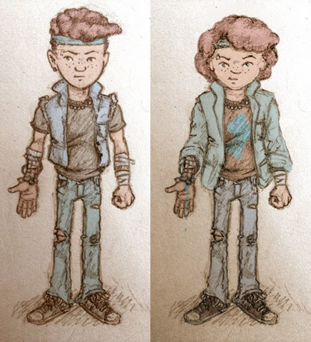
Early Pitch Refinement of Blue’s Illustrated Design
Instead of a denim jacket, I put him in a blazer with nice ‘80s shoulder pads and rolled up Miami Vice-style sleeves. I also dropped some of the 'tude from his face and skewed Blue a little younger than previously. (I believe he’s canonically 12 or so during the events of the game.) However, before pitching the more innocent Blue, I made sure to double down on the bad-boy aspect and offer a mulleted version.

Project Blue with a Mullet, aka Project Brew
The three of us talked a lot about the logistics of his shooting. I wanted an action that reflected the sprite, but we didn't want any more comparisons to Battle Kid than were already being made. So, no finger gun. Also, I wanted something more original than the palm-shots of Iron Man, so I sent a sketch expanding on the surgically embedded ventilation pipes I’d been drawing him with.
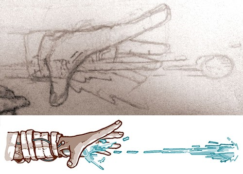
Initial Sketch and Final Illustration of Blue’s Shooting Mechanism in Action
It was well-received, and we talked even more about what he was shooting. I think the wildest suggestion I made was some type of goop-covered calcium deposit, like a hard, solid egg (or a lemon-sized kidney stone). Eventually we settled on an undefined bio-energy, something that’s definitely the result of OmniCorp’s experimentation, not something inherent to Blue himself.
One thing I find interesting with Project Blue, and this is direct praise for Ellen's art direction, is that the game is not overtly blue in color. The most prominent blue is more in the teal range (NES color $1C), and the only place that a bluer blue is used is really in the logo. I wanted to incorporate both the teal of the sprite and the stone-washed, sky blue of the logo into Blue's design to act as a bridge between these separate game components. For his t-shirt, I went with such a heavily sun-faded black that it's practically brown, and although we briefly discussed having some symbol or graphic on it, I would eventually opt for a simple orange stripe to avoid distraction and give a little saturated dash into the complementary hues within Blue's design.

A Full-Color Version of Blue’s Portrait, from an Abandoned Action 53 Vol. 4 Concept
Although we hadn't decided on the exact location for the game's city, we knew that it would be set in Asia. For Blue himself, I portrayed him as Afro-Asian with freckles. Having grown up in a notoriously bigoted area of the US, I saw the kind of hardships mixed race people face. Now, as part of a multicultural parenting community in Korea, I see that mixed race children, especially those with Black heritage, face similar hardships in East Asia. Also, I was surprised to find that freckles are looked down upon here to the point that many richer families subject their children to laser treatment for them. Blue's parentage would increase the difficulty he'd have as an orphan and his freckles subtly reinforce that he definitely doesn't come from a position of privilege.
As for other visual elements, the butterfly stitch on his eyebrow alludes to an injury sustained when he was captured, and the ball bearing necklace (which I don't think anyone's worn since Korn could sell out a stadium) provides a visual connection to the industrial world he inhabits (and Ellen's other sprites in the game, in particular, the watchers, mines, and orbs).

Detail of the Watcher from the Project Blue Cover Art
Finally, I had planned to portray the headband in his sprite as a sweatband style, but when drawing the cover art, I wanted something dramatically flapping in the wind, and repurposed a necktie for it.
-How do you interpret Ellen's designs, and how does it compare to other projects you've worked on?
Typically, I either work from very minimalist pixel art (such as for Swords and Runes) or from my own designs like in the later Gruniożercas. Both of those tasks leave a lot of room for the imagination to run wild. Ellen's work is very detailed though, so mostly, I just draw her sprites exactly as I see them with minor functional flourishes.
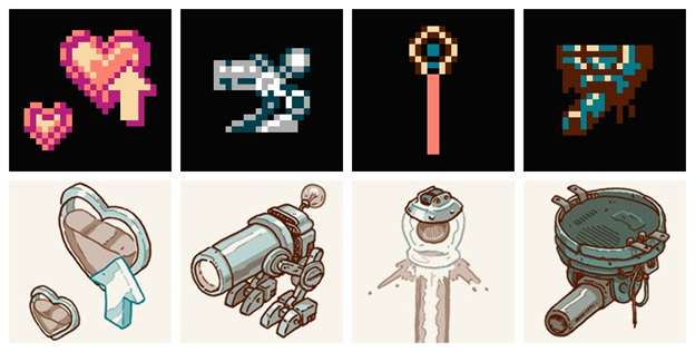
Project Blue Sprites and Accompanying Illustrations
Sometimes I’d misinterpret part of the sprite though. In the Omnibot, I had initially drawn the forehead covering as a visor, but she informed me it was instead intended as bandaging, so I fixed it up in the redraw. Other times, I would creatively interpret elements. For instance, what I assume was just anti-aliasing around the Omnibot’s eyes became Clockwork Orange-style eyelid clips to help convey the written description Ellen provided: “two crazed and hauntingly human eyes peek out of this robotic/cybernetic construct.”

Omnibot Sprite, Initial Lineart, Revised Lineart, and Final Illustration
These details are less drastic than the departures I took from Ellen’s designs in the cover art. I’ve always been a fan of overly detailed box art that deviated fairly heavily from the in-game portrayals. Thanks to amazing artists such as Mark Eriksen, the NES had quite a few of these covers. But other platforms, like the Atari consoles or early home computers, were a goldmine of them.

Details from Some of M-Tee’s Favorite Cover Art:
Bomberman (NES)/Bomber King (MSX), Mega Man 2 (NES, US), Guardic Gaiden (FC), M.U.L.E. (NES),
GUTZ (ZX Spectrum), Quest Forge (NES), Space Invaders (Atari 400/800), and Donkey Kong (Atari 2600)
Despite it having aged to a point of popular mockery, I strongly believe this type of cover art enriches the gameplay experience, opening the viewer up to the idea that the world being depicted is much larger than as seen through the lens of the gameplay screen, which very well might be only one of many abstracted interpretations of it. Approaching a similar aesthetic sincerely and without irony is difficult, and I hope I achieved that here.
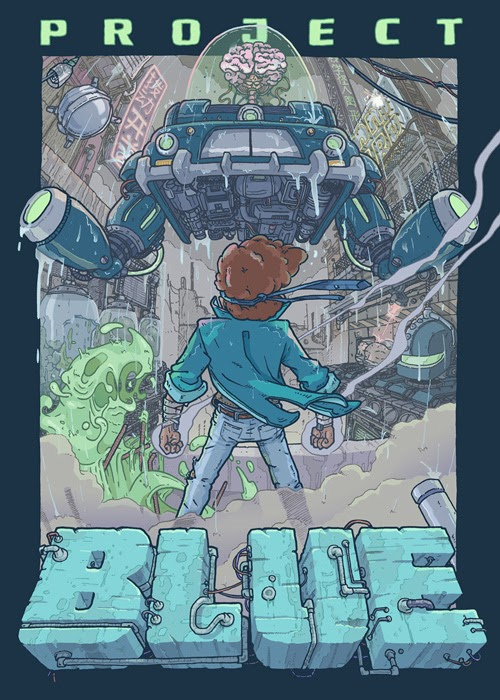
Project Blue Cover Art
Blue’s proportioned more heroically, and the Think Tank portrayed has been given a hot rod influenced makeover that prominently displayed its industrial undercarriage. For the manual though, I toned down the Doctor’s design, a stepping stone between the cover depiction and Ellen’s original spritework.

The Doctor Sprite and Manual Depiction
-You’ve worked with a number of different homebrewers. Is there a process for networking in this niche community?
Keeping up with where the conversation is happening can be a burden. At one point in time, very different dialogs were happening on the NESDev forums and on NA. Sometimes, the NESDev IRC seemed to have more activity than the forums as well. Now, a lot of it has shifted to twitter for announcements and Discord communities for development, as forum threads are getting less and less responses. I'd say being openly passionate about the work others are doing has been key to my reception.
-What was it like working with Donny and Ellen? How did you connect with them for this project?
I'm pretty sure I first met Ellen on the NesDev forums and we started emailing WIP pixel art back and forth for critique. For Project Blue, she approached me, and I was introduced to Donny through her. He had liked my Pyronaut poster and was wanting something similar. They've both been great to work with. It's clear that we all three had slightly different head-canons, and we'd have these long, creative email chains where we'd work them out before combining and revising the best parts of each for the final product.
Donny was more gameplay focused in his plans and whenever possible, leaned toward leaving room for the player to fill in the game world through their imagination. He was the voice of restraint which led to the clean, streamlined presentation of the game itself.
Ellen clearly was the most familiar with cyberpunk literature and media, and provided the more tragic aspects to the world such as the failed experiments and omnibots both being the products of experimentation on other children. She even communicated some of these ideas through level design in rather brilliant ways. As far as I know, she also came up with the amazing pun of Think Tank and the idea that the bosses were a board of directors.
With my background in education and interest in children's literature, I emphasized the contrast between Blue's innocence and the darkness of his situation while presenting the tragic elements of the world through humor in my writing. However, my biggest contribution was probably naming the boardroom directors and writing their backstories. I’m also unusually proud of how we explain the fact that each boss seems to show up twice, but is clearly destroyed each time (something we struggled with once we decided to name the bosses).

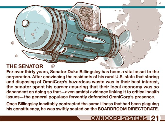
The OmniCorp Boardroom Directorate, from left to right:
Dr. Naomi Yoon, Madame Guang, Senator “Duke” Billingsley, and OmniCorp CEO Michael Guang
-You mentioned that the print manual's visual design will differ from that of the digital version, how so? Was it a challenge to adapt your artwork to two mediums and maintain a certain parallel between them?
I'm a huge supporter of the digital distribution of homebrew, so it’s important to me that download packages don’t feel like afterthoughts to physical releases. Aside from some version-specific text, the main difference in our digital manual is that it has been made to look like a fan-scan, maybe something one might have found on vimm.net in the early 2000s. Doing so required overlaying the paper texture, making sure that overlay is different on consecutive pages, showing the center staple, slightly tilting some spreads to imply inconsistency while scanning, and even simulating ink bleedthrough from the backs of pages.

Thumbing Through the Digital Manual
This allowed me to showcase what the manual may have looked like aged on lower grade paper, and provides the digital consumer a unique aesthetic in comparison to the crisp, clean, and new manuals that will come in the physical package.
-Manuals aren't the first thing people usually associate with homebrew, but Project Blue's stands out, not only because a lot of effort was clearly put into its design, but it also looks like something that would have been printed in the 80s, with all of the artistic preferences that might come with that period. Tell me about the intentions behind the manual's visual design.
At first, I was brought on to just make black and white illustrations, and Ellen or Donny would have handled the manual text and design, but there was a long time between when I joined the team and when the game reached a point that it was ready for artwork to be produced. During this wait, inspiration struck.
In the US at least, cheap printing methods were usually black and white, like most NES manuals. However, 80s/90s budget printings for Asian markets typically utilized a duotone printing method, where two contrasting colors would be printed in varying densities over each other to produce a fairly unique visual depending on the colors selected.

Details from an American Game Manual, Two Japanese Game Manuals,
and an ‘80s Elementary School Workbook from Korea
Back in ‘13 or so, I had previously attempted to imitate this method and failed. But while waiting on production of Project Blue to pick up, I saw how Arne of Androidarts did it and realized how simply it could be done. Eager to put the technique to use, I constructed a palette from the teal ($1C) and brown ($07) from the game’s most prominent subpalette, used it to make a small mock-up with one of my Cowlitz illustrations, and pitched it to Donny and Ellen for the manual.

Artwork by Arne Niklas Jansson, M-Tee’s Duotone Style Pitch,
and the Production Palettes of the Project Blue Operations Manual
They seemed to dig it, but pulling it off would require pretty intimate familiarity with the design choices that would have been made to compensate for drawbacks in the physical printing process. For instance, original duotone publications would typically limit the use of the darkest possible colors to minimize over-saturation of the paper, and would print text in a single color of ink to avoid headache-inducing halos in the case of printing misalignment. Excited to work within these restrictions, I would later ask to handle manual design as well.
-You also told me that you provided a lot of the lore-building written into the manual. How did that process unfold? Does your art guide how you build that world, or do you try to create and define that universe so it guides your art?
The writing definitely guided the art. I was about 60% finished with manual illustrations when I started having difficulty deciding exactly what to draw and how to draw it. I had been given a loose list, but I didn’t want to make anything that wouldn’t get used, nor did I want to make anything that would burden Donny into shoehorning it in. (He was handling writing and manual design at the time.)
Again, although (or because!) I create work for entertainment media, I feel the responsibility to address important topics. My work for the Cowlitz Gamers’ Adventures alludes to the effects of imperialism felt long after occupation, and the unpublished work I’d done on Pyronaut was heavily critical of short-term contract employment and the glorification of unsafe workplace cultures. Gruniożercas 2 and 3 were the only text-heavy works I’d put out recently though, and there’s just so much one can say about ethical pet ownership before getting repetitive.
The cyberpunk genre has a long historical context for social commentary, and the world Ellen and Donny had built of a street urchin up against a mega-conglomerate seemed ripe for realworld allegories. So I was becoming more and more anxious to help flesh out that aspect of their universe.
I eventually asked if I could write the manual as an in-world, OmniCorp document. Luckily, they dug that too, so I killed two birds with one stone. Now, I had a clear goal to direct the remaining illustrations and a platform to discuss the dangers of corporate lobbying, the privatization of social services, and the consequences that come with the lack of proper government oversight. Just wait until you see the company loyalty OmniCorp expects of its interns!
A Page from the Project Blue Operations Manual
Luckily, the promotional video for the Kickstarter campaign had already established an OmniCorp presence outside of the game. (Fun fact: Ellen managed to get the same actor who played Becky Carmichael in the video to provide the character’s signature in the manual as well).
With the manual writing, I hoped to match the faux-caring voice of internal corporate memos well enough that reading it fills anyone else who’s worked for any publicly-traded corporation with the same nauseating disdain I felt working at one myself. (I may have endured six long, dark, formative years at GameStop, whose corporate voice would later become infamous from its leaked coronavirus conference call).
-Given how much joy you derive from writing and world-building, have you written a standalone piece of fiction?
I have a handful of illustrated short stories and comics lying around (see my pre-M-Tee art above), and I spent the last few years teaching a creative writing workshop. So, I'd love to try my own hand sometime at penning proper juvenile literature, and might one day.
-Heck if you wanted to connect it to the games you work on, have you thought about novelizations of homebrews like the old Worlds of Power books?
A homebrew alternative to Worlds of Power? I love it. Let's get E.C. Myers on the phone. I have a folder full of elevator pitches ready to go.
-What new challenges were raised by Project Blue? What lessons did you learn that you would like to share with the people who follow in your footsteps?
Project Blue was a lot of firsts for me, and they all brought their respective challenges. I already mentioned the perspective of the cover art and the visual style of the manual, but it was also the first time I’d made art for enamel pins. I was really nervous about how those would turn out. I could mockup what I thought they’d look like, but it’s not like I could do a test-print at home or anything. Although there are some things I'd do differently for my next pin, I was pleasantly surprised with how these ended up.

Project Blue Enamel Pin
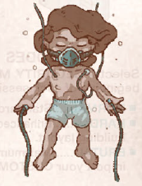
Working for Project Blue wasn’t all firsts though. Years earlier, I’d worked on another project that incorporated the brain in a jar trope. However, I hadn’t anticipated the challenge of not getting bored after drawing a half dozen of them. I couldn’t imagine being an animator and drawing them 24 times for every second.

A 2013 Brain Jar followed by a Small Pantry's Worth of Project Blue Jarred Brains
-I remember you posted a series of tweets about the other projects you had on your plate, what are you jumping into next? Considering everything you've created so far, do you have a dream project that you hope to bring into existence?
As of the time of writing, an opportunity for making a short Project Blue comic has come up, so I’m working on that. Afterward, I hope to finally finish up my end of Isolation for KHAN Games, and then hopefully release more games with Łukasz Kur (with whom I’ve worked on the Cowlitz Gamers’ Adventures and Gruniożerca series). Between the two of us, we've had a half dozen ideas for a fourth Gruniożerca and a couple of other projects on the table. But in the meantime, we're working on a small suite of very basic Pico-8 programs for my daughter. If they turn out okay, we’ll release them since there’s not a lot of software for infants and toddlers out there.
-I really appreciate you taking the time to talk with me and share your experiences. Is there anything else you would like to tell readers and fans?
Just a thanks to anyone still reading after the monstrosity of self-indulgence I’ve brought to this interview.
Conclusion:
Thanks for tuning in to this first episode of a series that will hopefully continue and provide deep dives into promising homebrew games coming across the finish line. What are your thoughts on Project Blue and its talented development team? What homebrews are you eagerly looking forward to? Perhaps you’ll see it here soon when…A Homebrew Draws Near! Command?
-
 12
12
-
 2
2


8 Comments
Recommended Comments
Create an account or sign in to comment
You need to be a member in order to leave a comment
Create an account
Sign up for a new account in our community. It's easy!
Register a new accountSign in
Already have an account? Sign in here.
Sign In Now